 Français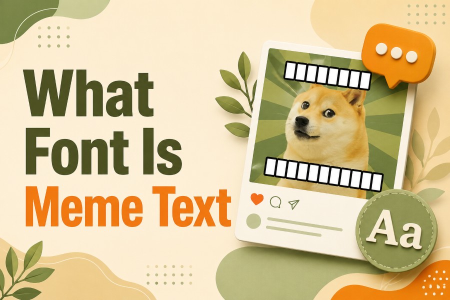
If you have ever seen a classic internet meme with bold white uppercase letters and a thick black outline, you have probably wondered: What font is meme text? That instantly recognizable style has been used across funny image macros, reaction memes, social posts, and viral screenshots for years.
The short answer is that classic meme text is most commonly associated with Impact, a bold condensed typeface that became popular because it is thick, readable, and easy to see on busy images. The familiar meme caption style usually uses white uppercase letters, a black outline, and simple top-and-bottom placement. This combination makes the joke easy to read even when the image behind it is messy, colorful, or low resolution.
But meme typography has changed. Modern meme creators now use Impact, Arial Black, Anton, Montserrat ExtraBold, Bebas Neue, and other bold fonts depending on the platform and style. TikTok memes, Instagram posts, Reddit image macros, and YouTube Shorts thumbnails often use different text styles, but they all follow one core rule: the caption must be readable fast.
This guide explains the classic meme font, why it works, how to recreate the look, which alternatives are useful, and how to choose the best font for memes today.
What font is meme text?
Classic meme text is most commonly associated with Impact, usually set in all caps with white letters and a black outline. Modern memes may also use fonts like Arial Black, Anton, Bebas Neue, Montserrat ExtraBold, or other bold sans serif fonts for a similar high-contrast caption style.
What Font Is Meme Text Usually?
The classic meme text font is usually Impact. When people ask what font do memes use, they are usually thinking of the classic image macro style: bold white uppercase text, thick black outline, and a short caption placed at the top or bottom of an image.
Impact works well because it is heavy and condensed. The letters are thick enough to stand out, but narrow enough to fit longer captions into a limited space. That balance made it ideal for early internet memes where images were often small, compressed, and shared quickly across forums, social media pages, and image boards.
The classic meme caption font became popular because it solved a practical problem. Memes need to be understood almost instantly. If the text is too thin, too decorative, or too low contrast, the joke gets lost. Impact gives the caption a loud, clear voice without needing a complicated design.
Most classic meme text also uses all caps. Uppercase letters create stronger visual weight and make the caption easier to scan. Combined with a black outline, white meme text stays readable on bright, dark, colorful, or low-quality images.
That said, not every meme uses Impact. Modern meme typography is broader. Social media creators often use bold sans serif fonts, app-native text styles, or template fonts from tools like Canva, Adobe Photoshop, Kapwing, Imgflip, and Meme Generator. The exact font matters less than the result: clear, bold, high-contrast text that supports the joke.
So, when someone asks “What font is meme text?” the best answer is: classic meme text is usually Impact, but modern meme text can use any bold readable font that creates fast visual impact.
Why Impact Became the Classic Meme Font
Impact became the classic meme font because it is easy to read, visually loud, and widely available. It was included with many Windows systems, which made it accessible to everyday users long before meme creation tools became common.
Early meme creators did not need a premium design app or custom font library. They could open an image editor, add text, choose Impact, make the letters white, add a black outline, and create a recognizable meme format in minutes. That accessibility helped the style spread.
The font also matches the tone of memes. Impact feels blunt, direct, and slightly exaggerated. It does not look elegant or subtle. It looks like it is shouting the joke at you, which fits the humor of many classic memes.
Another reason Impact worked so well is its condensed letter shape. Meme captions often need to fit across the width of an image. Wider fonts can run out of space quickly, especially when the caption is in uppercase. Impact packs a lot of visual weight into a narrow form, which makes it practical.
The black outline is just as important as the font. White text alone can disappear on bright areas of an image. Black text alone can disappear on dark areas. White text with a black outline works across many backgrounds, so meme creators do not need to carefully edit each image.
That is why the classic meme font style is really a combination of choices:
- Bold condensed font
- Uppercase letters
- White fill
- Black outline
- Short caption
- Top or bottom placement
The formula is simple:
Effective Meme Text = Bold Font + High Contrast + Short Caption + Clear Placement + Instant Readability
Impact became famous because it naturally fits this formula. It is not the only font that works, but it remains the most recognizable.
Best Fonts for Meme Text Today
Impact is still the classic option, but it is not the only good meme text font. If you are creating memes for Instagram, TikTok, Reddit, Facebook, X, or YouTube Shorts, you may want a font that fits the platform and tone.
Here are some useful meme font options:
Impact
Best for classic image macros and old-school meme captions. Use it when you want the instantly recognizable meme look.
Arial Black
A strong alternative that feels bold and simple. It is wider than Impact, so it works better for shorter captions.
Anton
A bold condensed sans serif font that feels modern and clean. It is good for social media meme posts and short punchy text.
Bebas Neue
A tall condensed font that works well for meme titles, thumbnails, and clean graphic captions.
Montserrat ExtraBold
A polished modern option for social posts, brand-safe memes, and meme-style graphics that need a cleaner look.
Helvetica Bold or Neue Haas-style fonts
Useful for minimalist memes, screenshot-style posts, and clean captions.
Roboto Black
A practical choice for Android-style or app-style meme graphics.
Oswald Bold
A condensed font that gives a strong headline look without feeling too heavy.
The best font for memes depends on the style you want. A chaotic reaction meme may look better with Impact. A polished Instagram carousel meme may look better with Montserrat ExtraBold. A YouTube Shorts thumbnail may need a bolder, cleaner font with bright colors and strong spacing.
For classic memes, use Impact. For modern social media memes, use bold sans serif fonts that stay readable on small mobile screens.
How to Create Classic Meme Text
Creating classic meme text is simple if you follow the same visual rules. You do not need to overdesign it. The goal is not to make the caption beautiful. The goal is to make it readable and funny fast.
Step 1: Choose a Bold Font
Start with Impact if you want the classic meme look. If Impact is not available, choose Arial Black, Anton, Bebas Neue, or another bold sans serif font.
Avoid thin, script, cursive, or decorative fonts for classic meme captions. They may look creative, but they often reduce readability.
Step 2: Use Uppercase Letters
Classic meme text is usually uppercase. Uppercase letters create a stronger shape and make the caption feel louder. This works especially well for jokes, reactions, and exaggerated statements.
For example:
Normal sentence style:
When you open one tab and your laptop starts flying
Classic meme style:
WHEN YOU OPEN ONE TAB
AND YOUR LAPTOP STARTS FLYING
The uppercase version feels more like a meme because it is punchier and easier to scan.
Step 3: Use White Text with a Black Outline
The classic meme caption style uses white text with a black outline. This creates contrast on almost any background.
If your design tool allows it, add a stroke or outline around the text. If it does not, use a meme generator that automatically applies the style.
A black shadow can help, but an outline usually looks more like classic meme text.
Step 4: Keep the Caption Short
Meme text should be quick to understand. If the caption is too long, the viewer has to work too hard before reaching the joke.
A strong meme caption usually has one simple setup and one punchline. Keep each line short, and avoid filling the whole image with text.
Step 5: Place Text Where It Reads Fast
Classic memes often place setup text at the top and punchline text at the bottom. This gives the viewer a simple reading path.
Modern memes may place text in the center, on a colored banner, or near the subject of the image. That is fine as long as the text does not cover the most important visual detail.
Step 6: Test It on Mobile
Most memes are viewed on phones. Zoom out or preview your meme at a small size. If you cannot read the caption quickly, increase the font size, shorten the text, or improve the contrast.
Tools like Canva, Adobe Photoshop, Kapwing, Imgflip, Meme Generator, and basic phone photo editors can all help you create meme-style captions. The tool matters less than the readability.
Common Meme Text Mistakes to Avoid
Meme text looks simple, but small design mistakes can make a meme harder to read or less funny. The most common problem is using a font that looks interesting but does not work on an image.
Thin fonts are one of the biggest mistakes. A thin caption may look clean on a blank background, but it can disappear on a photo. Memes often use busy images, so the text needs visual strength.
Another mistake is using too many words. If the viewer has to read a paragraph before understanding the joke, the meme loses speed. Meme humor depends on timing. Shorter captions usually land better.
Poor contrast is also common. White text without an outline can vanish on light areas. Black text can vanish on dark areas. A stroke, shadow, or background panel helps keep the caption readable.
Some creators also place text over the most important part of the image. If the face, object, or reaction is the joke, do not cover it. Place your caption in empty space or use top-and-bottom formatting.
Overusing decorative fonts can also hurt the result. A funny meme font does not need to be fancy. It needs to be clear. Script fonts, glitch fonts, and aesthetic fonts can work for certain meme styles, but they are not ideal for classic meme captions.
Here is a quick checklist for better meme captions:
- Use a bold font.
- Keep the caption short.
- Use strong contrast.
- Add an outline or shadow.
- Make the text readable on mobile.
- Do not cover the main part of the image.
- Match the font style to the joke.
- Avoid mixing too many fonts.
If you follow this checklist, your meme text will be easier to read and more likely to work across social platforms.
Meme Text for Social Media Posts
Modern meme text changes depending on the platform. The classic Impact style still works, but social media content often needs cleaner, more flexible typography.
On Instagram, memes often use bold sans serif fonts, clean white text, carousel-style layouts, and simple colored backgrounds. Impact can work, but modern fonts like Montserrat ExtraBold, Anton, or Arial Black may look more polished.
On TikTok, meme text often appears as short captions, overlays, or screenshot-style text. Readability matters because viewers scroll quickly. Large bold text with strong contrast works best.
On X, Reddit, and Facebook, classic image macros still feel natural. Impact-style captions can perform well because users recognize the format instantly.
On YouTube Shorts or thumbnail-style memes, the text often needs to be bigger and more dramatic. Bold fonts, thick outlines, and high-contrast colors help the caption stand out in a crowded feed.
If you want to create styled wording for short captions, profile text, or social posts, you can explore a Special font generator or social media font tools. These tools are useful for creative text styles, but they are different from image-based meme typography. A meme image usually needs a real design font, while copy-and-paste font tools use Unicode characters for text styling.
The best choice depends on your goal. Use Impact or a bold design font for meme images. Use copy-and-paste styled text for captions, bios, comments, and short social media text.
Conclusion
So, what font is meme text? The classic answer is Impact. It became the standard meme text font because it is bold, condensed, readable, and easy to recognize. When paired with white uppercase letters and a black outline, it creates the familiar meme caption style seen across classic image macros.
Modern meme creators have more options now. Fonts like Arial Black, Anton, Bebas Neue, Montserrat ExtraBold, Oswald Bold, and Roboto Black can all work depending on the tone and platform. The best meme font is not always the fanciest one. It is the one people can read instantly.
The practical takeaway is simple: choose a bold font, keep the caption short, use strong contrast, and test the design on mobile. If you are making a classic meme, start with Impact. If you are creating modern social media memes, try a few bold alternatives and pick the one that makes the joke clear fastest.
FAQs
What font do classic memes use?
Classic memes most commonly use Impact. The familiar style usually has white uppercase Impact text with a black outline. This look became popular because it is bold, readable, and easy to place over many types of images.
Is Impact the official meme font?
Impact is not an official meme font, but it is the most recognized classic meme text font. It became popular because many people had access to it, and its bold condensed shape worked well for image captions.
What font is used for white meme text?
White meme text is usually Impact with a black outline or stroke. The white fill makes the letters stand out, while the black outline keeps the caption readable on both light and dark image backgrounds.
What are good alternatives to Impact for memes?
Good alternatives include Arial Black, Anton, Bebas Neue, Montserrat ExtraBold, Oswald Bold, and Roboto Black. The best choice depends on whether you want a classic image macro look or a cleaner modern social media style.
Should meme text always be uppercase?
Classic meme text is usually uppercase because it feels louder and is easier to read quickly. Modern memes do not always need uppercase text, but short uppercase captions still work well for reaction memes and punchlines.
Can I use a font generator for meme text?
A font generator can help create creative copy-and-paste text for captions, bios, and social posts. For meme images, design tools like Canva, Photoshop, Kapwing, or Imgflip are usually better because they let you control font size, outline, and placement.